📦 Part 5 of Build Your Own Quant Research System — follow the series and you’ll build a complete, modular research toolkit from scratch, one tutorial at a time.
✅ Tested: vectorbt 1.1.1 · Python 3.12 · Last verified: 2026-10-08 · Update policy
📊 Market snapshot (as of 2026-10-08): SPY $777.22 · QQQ $757.73 · BTC $83,083 · ETH $2,579 — for context on when this was written.
In Part 1 we got Sharpe 1.03. In Part 2 we watched it decay to 0.36 out-of-sample. In Part 4 we learned the 1.67 “best” Sharpe was mostly luck.
This tutorial asks a different question: even if the Sharpe number were honest, is Sharpe the right number?
The answer is “not always.” Sharpe has three blind spots that matter in practice: it punishes upside volatility, it assumes returns are well-behaved, and its annualization hides a statistical lie. This tutorial gives you the metrics that fix each blind spot — Sortino, Calmar, CVaR, and drawdown duration — plus the code and the honest numbers for our MA strategy.
Risk note: Everything here is educational. Metrics describe the past; they don’t predict the future. Nothing in this article is investment advice.
1. Sharpe’s Blind Spots
Sharpe ratio is the default for a reason: one number, easy to compare, everyone knows it. But “everyone uses it” is not the same as “it’s sufficient.” Three problems:
Blind spot 1: it punishes upside volatility. Sharpe divides excess return by total standard deviation — up moves and down moves count equally. Imagine two strategies with identical average returns: Strategy A gains 2% every day like clockwork, then loses 10% once. Strategy B loses 2% daily, then gains 10% once. Same total volatility, same Sharpe — but you’d obviously prefer B’s shape. Sharpe can’t tell them apart because it treats a +10% surprise as exactly as bad as a −10% shock. Nobody ever complained about upside volatility.
Blind spot 2: it assumes tame returns. Sharpe’s interpretation (“1.0 is good, 2.0 is great”) leans on returns being roughly normal. Real strategy returns aren’t — they have fat tails and skew. A strategy that bleeds slowly and crashes rarely can show a lovely Sharpe right up until the crash. The ratio summarizes the middle of the distribution; the danger lives in the tails.
Blind spot 3: the √252 annualization trap. To annualize a daily Sharpe you multiply by √252. That step assumes returns are independent and identically distributed — each day a fresh, unrelated draw. Real returns have autocorrelation, volatility clustering, regime shifts. The √252 scaling is a convenient fiction; treat annualized Sharpes as comparable within one methodology, not as physical constants.
None of this means “don’t use Sharpe.” It means: Sharpe is the beginning of the conversation, not the end. The rest of this tutorial is the rest of the conversation.
2. The Downside Family: Sortino and Calmar
If Sharpe’s first sin is punishing upside volatility, the fix is obvious: only count the downside.
Sortino ratio
Sortino replaces total volatility with downside deviation — the standard deviation of returns below a target (usually 0, the “minimum acceptable return”):
from metrics import sortino

# Same returns series, honest comparison
print(sortino(strategy_returns))          # downside only
print(sortino(strategy_returns, target=0.0))
When is Sortino more honest than Sharpe? Whenever the return distribution is asymmetric. A strategy with occasional big up days and steady small downs looks worse on Sharpe than it deserves — the up days inflate the denominator. Sortino ignores them.
Rule of thumb: if Sortino >> Sharpe, the strategy’s volatility is mostly upside — good shape. If Sortino ≈ Sharpe, the distribution is roughly symmetric and Sharpe wasn’t lying. If Sortino < Sharpe… check your code, something’s off (downside deviation can’t exceed total deviation on the same series unless the target is above the mean).
Calmar ratio
Calmar asks a blunter question: annualized return divided by max drawdown. “How much return per unit of worst pain?”
from metrics import calmar

print(calmar(strategy_returns))  # CAGR / maxDD
A Calmar below 1.0 means the strategy earned less (annualized) than its worst drawdown — you’d need real conviction to hold through that. Calmar above 3.0 is excellent and rare. Unlike Sharpe and Sortino, Calmar is in “intuitive units”: everyone understands drawdown.
The catch: max drawdown is a single observation — the worst episode in your sample. One lucky sample without a crisis flatters Calmar badly. Which brings us to duration.
3. Tail Risk: VaR, CVaR, and Drawdown Duration
Sharpe, Sortino, and Calmar all summarize the typical experience. Tail metrics answer: “how bad can one day get?”
VaR and CVaR
Value at Risk (95%) is a threshold: “on 95% of days, you lose less than X.” Our MA strategy’s daily VaR₉₅ is −1.07% — a plain-English risk sentence.
Conditional VaR (expected shortfall) goes one step further: “when you’re in the worst 5% of days, your average loss is Y.” Ours is −1.65%. The gap between VaR and CVaR tells you about tail shape — a big gap means the tail is fat, and VaR alone was hiding it.
from metrics import var, cvar

print(var(strategy_returns, alpha=0.05))   # threshold
print(cvar(strategy_returns, alpha=0.05))  # average beyond threshold
We use historical VaR/CVaR — no normal distribution assumed. That’s the honest version: it can’t predict a worse-than-history day, but at least it doesn’t pretend the tails are thin.
Drawdown duration
Depth tells you how much you lost. Duration tells you how long you waited to get it back. Our MA strategy’s worst drawdown was 13.25% — but the underwater stretch lasted 195 bars, over nine months. A 13% drawdown that recovers in two weeks is noise. A 13% drawdown that lasts nine months is a regime you didn’t understand, and most humans capitulate long before recovery.
from metrics import max_drawdown_duration

print(max_drawdown_duration(strategy_returns))  # bars underwater
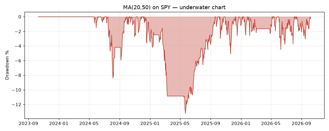
The underwater chart is the single most honest picture of a strategy. Peaks are vanity; the red regions are where you actually lived.
4. Reality Check: Our MA Strategy, Full Picture
Same data as Parts 1–4 (SPY daily, October 2023 to October 2026, 752 bars), same MA(20,50), same honest costs. Every number below comes from the same returns series — apples to apples:
| Metric | Value | What it says |
|---|---|---|
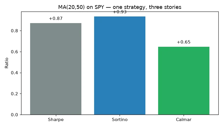
| Sharpe | +0.87 | Baseline. Decent, not great. |
| Sortino | +0.93 | Slightly better — some upside vol was punished unfairly. |
| Calmar | +0.65 | Below 1.0 — return didn’t cover the worst pain. |
| Max drawdown | −13.25% | The worst episode. |
| Max DD duration | 195 bars | ~9 months underwater. The real cost. |
| Daily VaR 95% | −1.07% | Normal bad day. |
| Daily CVaR 95% | −1.65% | When it’s bad, it’s 1.5× worse than VaR suggests. |
Three takeaways:
-
Sortino > Sharpe confirms the shape is okay. The strategy’s volatility skews upside — Sharpe was slightly unfair. But “slightly” is the key word; no metric rescues the strategy, they just describe it more precisely.
-
Calmar < 1 is the red flag Sharpe missed. A 0.87 Sharpe sounds tradeable. A 0.65 Calmar with a 9-month underwater stretch sounds like a strategy you’d abandon in month four. Same strategy, different story — that’s why you need the full suite.
-
CVaR/VaR = 1.54× quantifies the fat tail. If returns were normal, the ratio would be ~1.25×. The fatter tail means Sharpe’s normality assumption was flattering. Not fatal here, but now you know how to check.
A note on the Sharpe value: Part 1 reported 1.03 using vectorbt’s built-in. The 0.87 here is computed on strategy-equity returns with an explicit annualization — same strategy, slightly different return definition. The ranking across metrics is what matters, and that’s internally consistent.
Run it yourself: metrics_demo.py prints this table and both charts. Your numbers will differ slightly (Yahoo data updates daily).
5. Merge Into the Toolkit: metrics.py
This tutorial isn’t a standalone trick — it’s Part 5 of a system we’re building together. The metrics now live as the fifth module of goosos/quant-toolkit:
from quant_toolkit.backtest import run_backtest, ma_crossover_signals
from quant_toolkit.metrics import metrics_table

entries, exits = ma_crossover_signals(price, fast=20, slow=50)
pf = run_backtest(price, entries, exits)

rets = pf.value().pct_change().dropna()
t = metrics_table(rets)
print(f"Sharpe {t['sharpe']:+.2f} | Sortino {t['sortino']:+.2f} | Calmar {t['calmar']:+.2f}")
One design decision worth knowing: every function takes a returns series, not a portfolio object. Returns are the lingua franca — the same metrics_table() works on vectorbt output, on a CSV of live trades, on anything. The toolkit stays decoupled from any single backtesting engine.
Why a toolkit, not just scripts? Each tutorial in this series adds one module. By Part 10 you’ll have backtest, validation, data, overfitting, metrics, costs, and sizing — a research system you understand line by line, because you watched every line get written. That’s the difference between using a library and owning your process.
Next: Part 6: Slippage & Commissions adds
costs.py— honest cost modeling that kills most “profitable” strategies.
FAQ
Which metric should I actually use?
All of them, as a panel. Sharpe for the baseline everyone understands, Sortino to check the shape, Calmar for the pain-per-return gut check, CVaR for the tail, drawdown duration for the “can I actually hold this” test. Any single number can be gamed or mislead; the panel rarely lies all at once.
My Sortino is way higher than my Sharpe. Is that good?
It means upside volatility was dragging Sharpe down — the strategy has positive skew. That’s genuinely good shape. But check why: a few lucky moonshots can inflate Sortino just as selection bias inflates Sharpe (see Part 4).
Why not just use Calmar for everything?
Because max drawdown is one observation. Change the sample window slightly and Calmar jumps around — it’s the noisiest of the bunch. Use it as a sanity check (“is return covering the worst pain?”), not as an optimization target. Optimizing Calmar directly is a great way to overfit to one historical episode.
Annualized or not?
Annualize when comparing across frequencies (daily vs monthly strategies). Don’t treat the annualized number as a physical constant — the √T scaling assumes i.i.d. returns, which is false. Report both the raw and annualized figures when precision matters.
Do these work for crypto (24/7 markets)?
Yes, with one adjustment: use 365 instead of 252 for periods_per_year. The functions take it as a parameter for exactly this reason.
References
- Sharpe, W. F. (1994). The Sharpe Ratio. Journal of Portfolio Management — the original.
- Sortino, F. A., & van der Meer, R. (1991). Downside Risk. Journal of Portfolio Management — the downside-deviation alternative.
- Rockafellar, R. T., & Uryasev, S. (2000). Optimization of Conditional Value-at-Risk. — the CVaR foundation.
- goosos/metrics-tutorial — full code for this article.
- goosos/quant-toolkit — the growing toolkit;
metrics.pyis the Part 5 module.
Further Reading
- Part 1: VectorBT Tutorial — the backtest; adds
backtest.py. - Part 2: Walk-Forward Analysis — out-of-sample honesty; adds
validation.py. - Part 3: Data Cleaning & Alignment — garbage in, garbage out; adds
data.py. - Part 4: Backtest Overfitting — DSR & PBO; adds
overfitting.py. - Part 6: Slippage & Commissions (upcoming) — adds
costs.py: the costs that kill strategies.
Part 5 of Build Your Own Quant Research System · Code: goosos/metrics-tutorial · Toolkit: goosos/quant-toolkit · Next: Part 6: Slippage & Commissions
